Something unusual happened at Apple this year—macOS 27 “Golden Gate” barely wants to talk about AI.
Instead, it’s quietly reshaping how your Mac feels, looks, and responds in everyday use.
And for a beta packed with subtle tweaks, it’s already dividing longtime Mac users.
Table of Contents
ToggleWhat Happened
Apple’s WWDC 2026 spotlight may have been dominated by Apple Intelligence delays, but macOS 27 Golden Gate is doing something different: refining the “non-AI” experience.
Running on early M1 MacBook Air hardware, the update focuses on what Apple calls “platform improvements”—a mix of design adjustments, performance boosts, and usability fixes.
Here’s what stands out immediately:
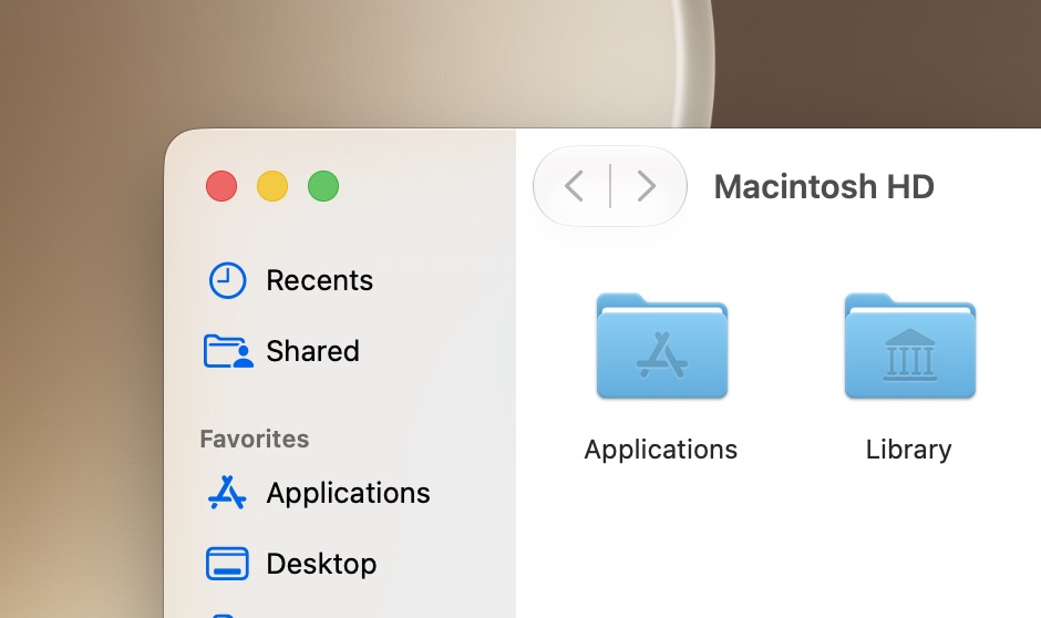
- A redesigned Liquid Glass system with a fine-tuned opacity slider
- Reworked window corners and sidebar behavior
- Better external display support, including 5K ultrawide compatibility
- Menu bar upgrades like a battery icon that embeds percentage inside it
- New virtualization tools for developers and Linux workflows
- Faster system interactions across Safari, AirDrop, OCR, and login flows
It doesn’t scream “revolution.” But it feels different in daily use.
Why It Matters
Apple isn’t just polishing visuals—it’s quietly correcting design friction introduced in earlier versions.
A few key changes stand out:
UI Control is no longer binary
Instead of “Clear vs Tinted,” users now get a full Liquid Glass slider. It even appears during setup, meaning Apple is letting users decide the aesthetic direction from day one.
Window behavior is being rebalanced
Golden Gate reduces extreme transparency issues and brings back clearer structure:
| Area | Before (Tahoe) | Now (Golden Gate) |
|---|---|---|
| Sidebars | Floating layered look | Edge-to-edge alignment |
| Window corners | Highly rounded | Moderately rounded |
| Toolbar design | Optional hard divider | More consistent structure |
The result: fewer visual conflicts, especially when text overlaps busy backgrounds.
External display upgrades quietly fix real pain points
Apple adds native support for 5K ultrawide displays, plus better window memory across docking setups—something remote workers have complained about for years.
Must Read: 2026’s Surprising Discovery Reveals 4 Massive Gene Waves That Built Complex Life
A System That Feels Faster—Even If You Can’t Measure It
Golden Gate leans heavily on what Apple calls “responsiveness improvements.”
No flashy number jumps. Just friction removal:
- Faster AirDrop discovery and transfers
- Smoother Safari scrolling
- Quicker lock-screen user switching
- Faster OCR for text in images
- Faster network storage browsing
It’s the kind of upgrade you feel, not benchmark.
And that’s intentional.
Hidden Problem: Design Consistency Is Still Fragile
For all the improvements, Golden Gate still struggles with one recurring issue: visual clarity under heavy UI effects.
Even with toned-down glass effects, certain areas still show:
- Text blending into backgrounds
- Overlapping UI elements in high-transparency modes
- Inconsistent “glass strength” across system apps
Apple may have reduced the problem—but it hasn’t eliminated it.
And there’s another tension brewing underneath: too many UI philosophies coexisting at once.
Big Sur curves, Tahoe glass layers, Golden Gate structure—it’s all still there in fragments.
Contrarian View: Apple Is Actually Backtracking
Not everyone sees Golden Gate as an improvement.
A growing counter-argument inside the developer community is that Apple is quietly reversing its own design direction.
Critics point out:
- “Liquid Glass” is being softened, not expanded
- Visual effects are becoming less experimental
- UI elements are returning to more traditional boundaries
One way to read it: Apple is correcting mistakes.
Another way: Apple is retreating from bold design ambition.
And then there’s Xcode 27’s new feature that stands out oddly from everything else—per-window color tinting.
It works beautifully in development tools. But it raises a question no one at Apple has answered yet:
If customization is good in Xcode… why not the whole system?
What Happens Next
The direction of macOS 27 Golden Gate suggests Apple is shifting focus:
- Less visual experimentation
- More performance and usability refinement
- More user control over interface intensity
- Deeper virtualization and developer tooling support
The biggest wildcard is whether Apple expands system-wide theming or keeps it locked inside pro apps like Xcode.
If it spreads, macOS could become dramatically more customizable.
If it doesn’t, Golden Gate may be remembered as a “cleanup release” after design controversy.
Either way, Apple is clearly listening—but selectively.
Final Thought
macOS 27 Golden Gate doesn’t try to impress with spectacle. It tries to remove annoyance.
But in doing so, it raises a bigger question:
Is Apple quietly rebuilding macOS into something more stable—or simply afraid to keep pushing its design identity forward?
That answer may define the next decade of the Mac.
Disclaimer
This article is based on publicly available information from early macOS 27 Golden Gate beta reports. No facts, quotes, or outcomes were invented. Interpretations reflect current analysis and may evolve as Apple releases future updates.